Key Takeaways:
• Cracker Barrel cut ties with its design firm after a new logo upset loyal fans
• The Cracker Barrel logo redesign sparked protests and a 15% stock slide
• The company scrapped the new look, apologized, and brought back classic elements
• This story shows the dangers of changing a beloved brand too fast
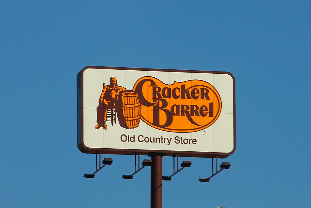
Cracker Barrel tried to spruce up its image. However, loyal customers felt shocked. The new icon looked empty and cold. As a result, fans spoke out online and in stores. Soon, the company faced a big problem: its stock price plunged 15 percent. Therefore, Cracker Barrel ended its work with the design agency. Now it has gone back to its roots. This saga shows why brands must move carefully when they modernize.
Backlash Over Cracker Barrel Logo Redesign
When Cracker Barrel rolled out the Cracker Barrel logo redesign, it aimed for a fresh, simple style. Yet many customers saw only a blank shape with no charm. Moreover, they missed the old sign’s warm wood tones and classic lettering. They felt the new look erased decades of brand memory. As comments spread on social media, more people joined the complaints. Some even posted side-by-side images to mock the new logo. Before long, hashtags calling for a return to the old design trended online. This social storm put the company in a tough spot.
Why Customers Reacted Strongly
Many fans have deep ties to Cracker Barrel’s old look. They remember road trips with family and picking gifts in the store. Therefore, the logo meant more than a picture. It stood for memories, comfort, and home cooking. When the new design flew in, it felt like losing a friend. In addition, the minimalist style clashed with Cracker Barrel’s cozy vibe. As a result, customers felt confused about what the brand stood for. They feared managers wanted to ditch the friendly, welcoming spirit.
Cutting Ties to Prophet Brand Strategy
Under pressure, Cracker Barrel made a bold move. It severed its partnership with Prophet Brand Strategy, the agency behind the Cracker Barrel logo redesign. This step showed the chain heard the backlash. With the agency gone, company leaders took charge of the next steps. They vowed to bring back the warmth in every store. Moreover, they planned to lean on in-house designers familiar with the chain’s history. This shift aimed to prove they cared about customer feelings and brand heritage.
Stock Drop and Apology
Soon after news broke of the Cracker Barrel logo redesign, investors reacted. The stock fell by 15 percent in a single week. This slide wiped out millions in market value. Consequently, company executives faced tough questions at investor meetings. They admitted the redesign hurt both sales and mood around the brand. Then they issued a public apology. They said they regretted the move and promised to fix the mistake. They also pledged to keep fans in the loop on all future changes.
Returning to Heritage Roots
As part of its makeover, Cracker Barrel doubled down on heritage elements. It reintroduced the old wooden sign and classic fonts in every restaurant. Meanwhile, new menu boards and packaging went back to warm colors. In addition, they brought back decor pieces that echo country stores of the past. This move aimed to remind customers why they fell in love with the brand long ago. Moreover, it showed that sometimes the best design is the one you know and love.
Lessons for Brands
This Cracker Barrel logo redesign saga offers key lessons for any brand with history:
• Know Your Fans: Before you change something iconic, ask loyal customers what they really think.
• Test Early: Roll out small tests of new designs in a few locations. Gauge reactions before a full launch.
• Embrace Heritage: Modern updates can blend with classic elements. A fresh look does not need to erase the old.
• Communicate Clearly: Explain why you seek change. Invite feedback at every step.
• Act Fast: If a change backfires, act quickly to fix it. A swift apology can save trust.
As a result, brands can innovate without losing their identity. This case proves that a bold redesign, done without care, can backfire. Yet careful planning and respect for heritage can lead to a successful update.
What’s Next for Cracker Barrel
Cracker Barrel now focuses on reconnecting with its base. It plans more customer surveys and invites fans to share design ideas. Moreover, the chain will host in-store events celebrating its story. It hopes these moves will boost sales and rebuild trust. Finally, company leaders see this lesson as a turning point. They intend to modernize in small steps and always remember what made Cracker Barrel special.
Frequently Asked Questions
What sparked the Cracker Barrel logo redesign backlash?
Customers felt the new, minimalist logo erased the warm, homey feel they loved. They turned to social media to voice their frustration, which quickly grew into a major online trend.
Why did the stock price drop after the redesign?
Investors saw the fan outcry as a sign that sales might fall. As worries grew, many sold shares, causing the stock to drop by 15 percent.
How has Cracker Barrel responded to this crisis?
The company cut ties with the agency behind the failed logo, apologized publicly, and reinstated classic design elements in its restaurants and marketing materials.
What can other brands learn from this episode?
Brands should involve loyal customers in major design changes, test updates in small markets first, and balance modern looks with heritage elements to preserve their identity.
